Opening Frame: The Power of Color Grading in Iconic Films
Color grading is a crucial element in modern filmmaking, shaping the mood, tone, and emotional impact of a film. Two films that showcase the power of color grading are Mad Max: Fury Road and The Matrix. These movies use color not just to enhance the visual appeal but to tell a deeper story, immersing the audience in their unique worlds.
Mad Max: Fury Road plunges viewers into a vibrant, post-apocalyptic wasteland, where bold oranges and teals create a stark, hyper-stylized environment. On the other hand, The Matrix employs a green tint to depict a world of artificiality, making the distinction between reality and the digital Matrix clear. This article explores how the deliberate use of color in these films elevates them from mere visual spectacles to immersive, narrative-driven experiences.
Establishing the Visual Worlds: A Brief Overview
Mad Max: Fury Road, directed by George Miller, crafts a world where the harsh desert environment is brought to life through intense orange and teal contrasts. The orange hues represent the relentless sun and the fiery destruction that permeates the film, while the cool teals highlight the mechanical, night-time aspects, creating a vivid dichotomy between the organic and the synthetic.
In contrast, the Wachowskis’ The Matrix uses a green tint to differentiate the artificial world of the Matrix from the real world. This green hue is present in every frame within the Matrix, subtly reminding the audience of the omnipresent digital construct and reinforcing the film’s themes of control and illusion. Both films use color grading not just to set the scene but to deepen the viewer’s understanding of the worlds they depict.
Mad Max: Fury Road – The Power of Orange and Teal
In Mad Max: Fury Road, color grading is a driving force behind the film’s intense, almost surreal visual experience. The film’s palette is dominated by vibrant oranges that represent the scorching heat of the desert and the relentless energy of the chase. These warm tones are contrasted by cool teal colors that highlight the mechanical elements and night scenes, creating a dynamic visual tension.
This contrast between orange and teal is not just visually striking but also thematically significant. It symbolizes the clash between the organic world—represented by the orange, sun-soaked desert—and the mechanical, represented by the cold, metallic teal of the war machines. The interplay of these colors heightens the film’s chaotic energy, making every scene feel both larger-than-life and deeply immersive.
In scenes like the sandstorm sequence, the color grading transforms the environment into something almost otherworldly, emphasizing the raw, elemental forces at play. Through its bold use of color, Mad Max: Fury Road creates a world that is as intense and unyielding as its characters, using color to push the narrative forward and keep the audience on the edge of their seats.
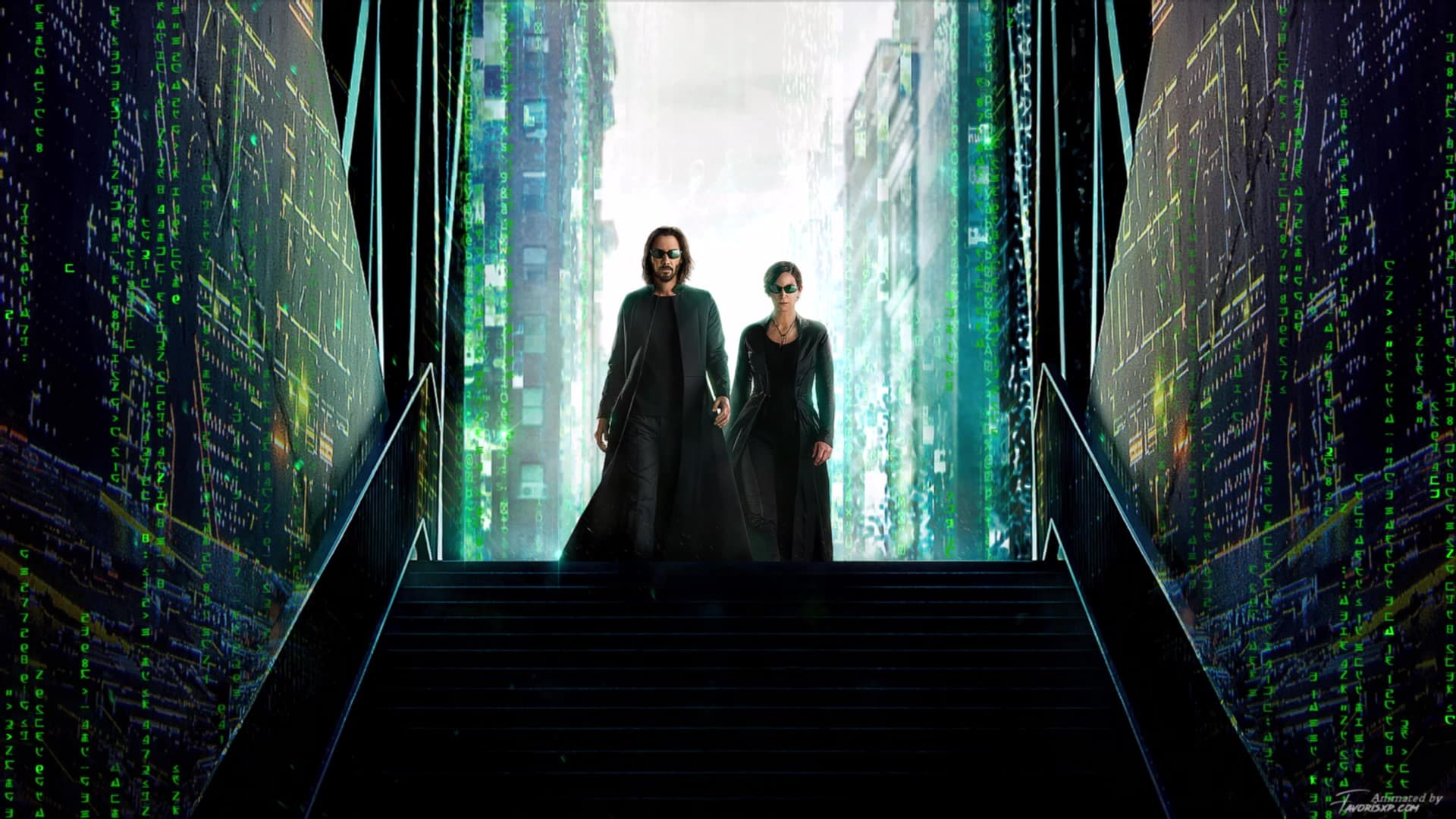
The Matrix – Green as a Symbol of Artificial Reality
In The Matrix, the Wachowskis employ a distinctive green tint to signify the artificial nature of the Matrix itself. This choice of color grading is subtle yet incredibly effective, providing an omnipresent reminder of the digital world in which the characters are trapped. Every scene within the Matrix is bathed in this greenish hue, setting it apart from the more natural, bluish tones of the real world.
The green tint serves multiple purposes. On a narrative level, it visually differentiates the Matrix from reality, reinforcing the film’s central theme of questioning what is real. The color green, often associated with old computer screens and coding, hints at the underlying digital nature of this simulated world. This choice makes the Matrix feel cold, sterile, and, most importantly, controlled—a sharp contrast to the chaotic, warm-toned real world where the characters fight for their freedom.
This color grading is particularly impactful in key scenes, such as when Neo first awakens in the real world. The stark difference in color palette underscores the shock and disorientation he feels, making the audience share in his experience. The green tint in The Matrix is more than just a visual style; it’s a narrative tool that deepens the viewer’s understanding of the film’s themes and the characters’ struggles.
Comparative Analysis: The Impact of Color Grading on Storytelling
When comparing Mad Max: Fury Road and The Matrix, it’s clear that color grading plays a pivotal role in shaping the narrative and emotional resonance of each film. In Mad Max: Fury Road, the aggressive use of orange and teal creates a world that feels both hyper-real and nightmarishly intense. This color palette is key to conveying the film’s relentless pace and the harshness of the environment, making the viewer feel the heat, the dust, and the constant danger.
In contrast, The Matrix uses color grading to subtly manipulate the viewer’s perception of reality. The green tint that pervades the scenes within the Matrix serves as a constant reminder of the artificial nature of this world, making the viewer question what is real alongside the characters. This use of color is essential to the film’s philosophical undertones, adding layers of meaning to what could have been just another action-packed sci-fi film.
Both films demonstrate how color grading can transcend its technical roots to become a powerful storytelling device. While Mad Max: Fury Road uses bold contrasts to create an immediate, visceral impact, The Matrix employs a more subdued approach, using color to quietly but effectively shape the viewer’s understanding of the narrative. Together, these films highlight the diverse ways in which color grading can enhance the cinematic experience, turning visuals into a critical component of storytelling.
Lessons Learned: How Filmmakers Can Leverage Color Grading
The use of color grading in Mad Max: Fury Road and The Matrix offers valuable lessons for filmmakers looking to enhance their storytelling through visual elements. One key takeaway is the importance of consistency in color grading to maintain the mood and tone of the film. In Mad Max: Fury Road, the consistent use of high-contrast orange and teal creates a world that feels unified in its chaos, drawing the audience into its dystopian reality. This approach shows how color can be used not just to differentiate scenes, but to create an entire world that feels cohesive and immersive.
Another lesson is the strategic use of color to signify different aspects of the story. The Matrix uses its green tint to subtly signal the artificial nature of the Matrix, which is a clever way of using color grading to reinforce narrative themes without relying on dialogue or exposition. Filmmakers can learn from this by considering how color can be used to convey subtext and deepen the audience’s understanding of the film’s themes and characters.
Finally, these films illustrate the importance of aligning color grading with the film’s genre and narrative goals. The bold, saturated colors of Mad Max: Fury Road perfectly suit its over-the-top, action-packed storyline, while the cooler, more subdued palette of The Matrix aligns with its cerebral, dystopian themes. Filmmakers should consider how their color choices support the overall narrative and mood they wish to convey, using color grading as a tool to enhance, rather than distract from, the story.
The Lasting Impact of Color Grading in Cinema
Color grading is far more than just a post-production process; it’s a powerful tool that can shape the viewer’s emotional and psychological experience of a film. As demonstrated by Mad Max: Fury Road and The Matrix, the careful use of color can transform a movie, making its themes more resonant and its visuals more impactful. These films show how color grading can be used to create a unique atmosphere, define the narrative, and immerse the audience in the story.
As we look to the future, the evolution of color grading will likely continue to push the boundaries of visual storytelling. With new technologies and techniques, filmmakers will have even more opportunities to use color in innovative ways, enhancing the art of cinema and offering audiences new, immersive experiences. In the end, color grading will always remain a crucial aspect of filmmaking, ensuring that the visual language of cinema continues to evolve and inspire.
Related Posts

The Art of Rebellion: How Accepted Redefines Success Through Unconventional Paths

Building a Dream from a Lie: The Hilarious Chaos of Creating a Fake College in Accepted